Recent Work

Portfolio

Portfolio

Tribe Move's Decoder Landing Page

Tribe Move's Decoder Landing Page

Tribe Move's Decoder Landing Page

A product landing page for an enterprise HR assessment platform.

A product landing page for an enterprise HR assessment platform.

Client

Tribe Move

Industry

Human Resources

Work

Web Design & Development

01.

Background

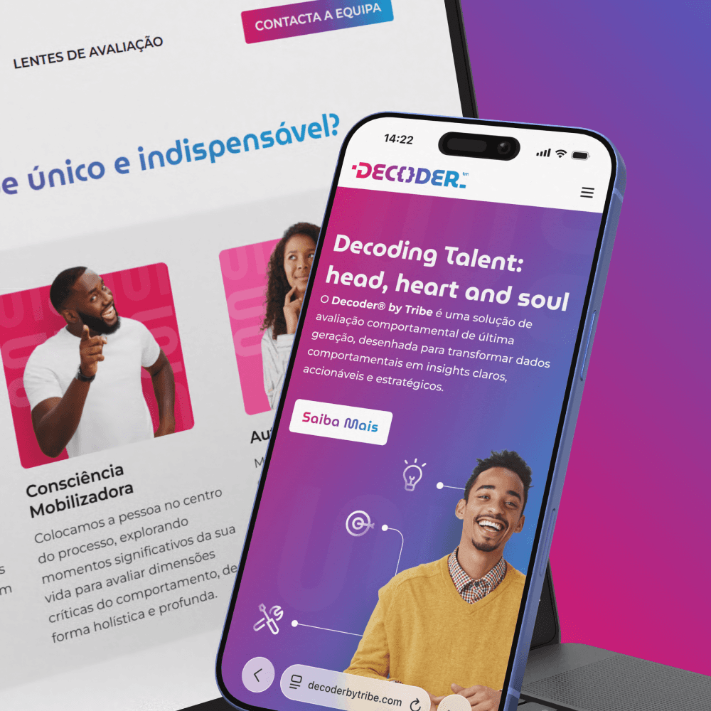
Tribe Move needed a dedicated landing page for the Decoder App that would introduce the product to clients. The goal was to communicate the platform's capabilities while reinforcing Tribe Move's position as a forward-thinking team delivering unique organizational insights.

02.

Challenge
Decoder needed a marketing website that could communicate trust and professionalism while making the platform feel approachable, innovative and easy to adopt. The value had to be easy to understand and able to get potential clients excited.

Before Decoder, much of the assessment process relied on manual administration. Employees had to be individually added to the system, permissions were managed one person at a time, and large assessment campaigns became increasingly time-consuming as organizations grew. To make matters more complex, the platform needed to satisfy enterprise-grade security standards for banking clients while remaining intuitive enough for hundreds of employees completing assessments across different devices.

03.

Our Solution

We designed and developed a product-focused landing page that extended Decoder's visual identity. Through custom graphics, motion, 3D product mockups and concise messaging, we translated a complex HR platform into clear value.

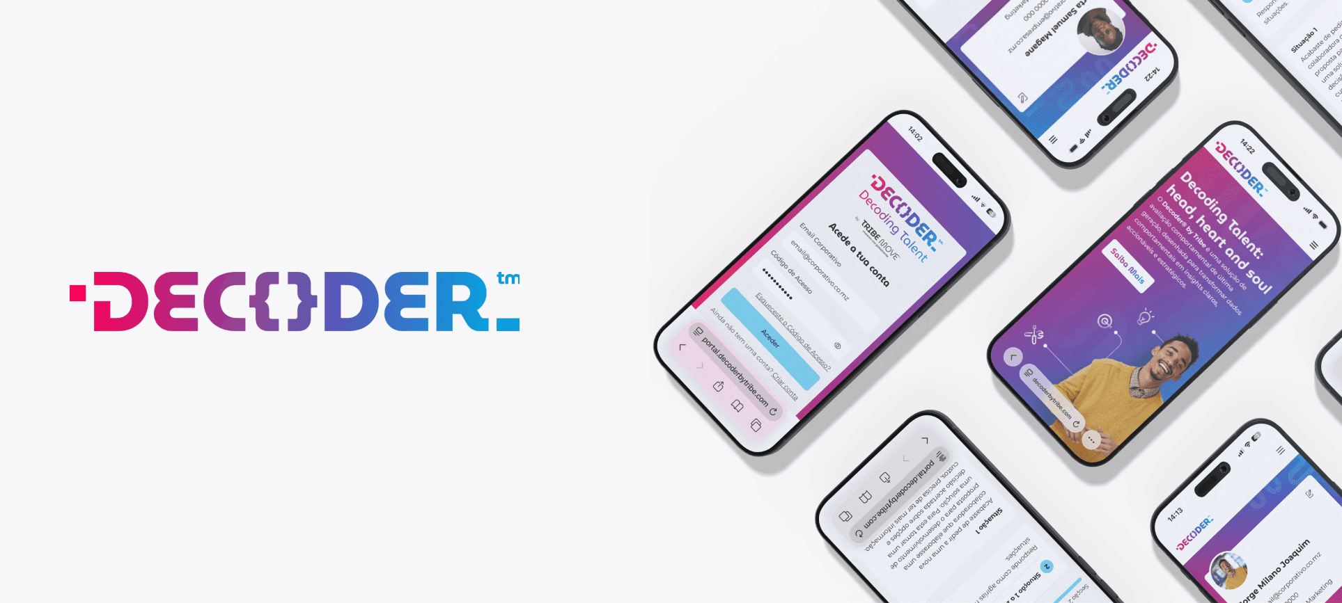
We designed and developed a secure assessment platform that allowed employees to complete personalized evaluations, schedule interviews, and manage their profiles from any device. Beyond the original brief, we introduced bulk user management through CSV imports, allowing administrators to onboard entire organizations at once, assign roles automatically, and manage permissions and assessments in groups instead of individually. What previously required hours of repetitive administrative work became a process that could be completed in minutes.

04.

Design

While the App prioritized focus and usability, the landing page was designed to bring confidence. We amplified the brand through expressive gradients, thoughtful animations and familiar visual elements that created continuity between the marketing website and the App itself.


The same characters and visual assets introduced on the landing page reappear throughout the application, creating a seamless brand experience that makes users feel immediately familiar with the platform when they sign in.

A clean, modular interface prioritizing clarity, consistency and efficient task completion. Every workflow was intentionally simplified to respect the user's time. Employees could quickly find and complete assessments, while administrators could confidently manage hundreds of participants without unnecessary complexity. The visual language balanced professionalism with warmth, using gradients, approachable colors, and clear interactions to make an otherwise formal assessment experience feel welcoming.

05.

Impact

By designing the landing page and App as a single, connected experience, we aimed to create a brand journey that feels consistent.

  • Created a cohesive visual identity spanning both the marketing website and the App.

  • Simplified complex product messaging into a clear, engaging experience for decision-makers.

  • Delivered a scalable landing page that supports future product growth.

Contact Us

Need a similar project? Let's Chat.

Fill out the form or email us at info@crescente.design and we'll get back to you as soon as possible.

Alternatively, Book a Meeting.

Monday to Friday

09:00 - 17:00

Contact Us

Thinking of something similar?

Fill out the form or email us at info@crescente.design

and we'll get back to you ASAP.

Alternatively, Book a Meeting

Monday to Friday

09:00 - 17:00